More Governmental Recommendations: Dietary Guidelines
In an earlier post I offered some comments about the Physical Activity Guidelines that came from the US Health Department as an example of Governmental Public Health recommendations. In that post I proposed 4 requirements for a successful public campaign.
- It has to be easy to understand and remember.
- It has to be within the reach of most people.
- It has to be widely communicated.
- It has to be be medically effective.
It will be noted that I put "medically effective" last. That's just me being cheeky. Obviously they have to be medially effective or else it's not worth starting a campaign. But you never know. In any case, I am not proposing that these are listed in any kind of order.
For this post I wanted to take a look at another public effort to make Americans better off. I introduced the Physical Activity Guidelines as "one of the least successful" campaigns so today I want to look at the absolute least successful: the Dietary Guidelines published by the US Department of Agriculture.
I say the Dietary Guidelines are ineffective, but that's not exactly true. In fact, far more people are affected by them than the Physical Activity Guidelines because the Dietary Guidelines influence various Federal Nutrition programs like School Lunches, School Breakfast and Nursing Home menus. That means that the Dietary Guidelines actually matter to a number of people, which makes them worth fighting over. And "fighting" is the correct word. A quick internet search will find that most people seem to hate them, and hate them all the more because despite whatever flaws they have, they have a real impact on peoples' lives. By way of contrast, there are no Federal Programs that are based on the Physical Activity Guidelines, so there's no real importance to them and no one has much incentive to complain about them.
But on the other hand, the Dietary Guidelines are clearly ineffective, because since the Dietary Guidelines came out in 1980, obesity rates have steadily gone up, a point mentioned often by the critics of the Guidelines. And there are many health issues associated with obesity (though not necessarily caused by obesity) which haven't been getting better either.
The general public mainly interacts with the Dietary Guidelines through the Nutrition Labels placed on foods. These are ubiquitous, and helpful, though I would suggest that they could use some work. Some of the portion sizes are borderline useless (how much is an ounce of salad dressing?). And I'd appreciate it if in addition to the label, there was some sort of standard labeling or markings to indicate high-fat, low-fat or low-sodium foods. They also have a neat recipe section of their dietary guidelines website, each recipe with a Nutrition Facts label, natch.
But it's important to note that the Dietary Guidelines are not a diet. I feel a bit off-base commenting on the document because it says right in the Executive Summary that "The Dietary Guidelines is designed for policymakers and nutrition and health professionals..." and I'm neither of those. However, I will unburden myself of an opinion anyway and say that the Dietary Guidelines is one of the most useless documents I've ever read. The Dietary Guidelines, themselves, are made up of a chatty document with various online resources including a science section that's even chattier. It often reads like a document about the Guidelines, rather than the Guidelines themselves. The Dietary Guidelines are 164 pages long and it's not until page 18 that the actual recommendations make an appearance. While the Physical Fitness guidelines get straight to the point and emphasize graphically and verbally that you'll live longer if you stay active, the Dietary guidelines list numerous problems facing Americans ("cardiovascular disease, type 2 diabetes, obesity, liver disease, some types of cancer, and dental caries") but never actually say that following the Guidelines will prevent or cure those ailments. It's kind of implied. But a lawyer could easily argue that no promises or guarantees are made.
The word "Science" makes a big impression. A quick keyword search finds around 90 hits for "science" or "scientific". In a 164-page document where at least 10% of the pages are filler (chapter breaks and such) that's pretty impressive. In fact some pages read like a science report about scientific scientists doing scientific things. The word "science" is apparently deployed as a sort of talisman. Like Van Helsing holding a crucifix to ward off Dracula. I wonder why?
Apparently back in 2016, a hue and cry was raised about the Dietary Guidelines and their poor process and obscure scientific methods, which prompted Congress to launch an investigation into the whole thing, so the over-emphasis this time around is probably understandable. Still, it's an odd document. It's a bit like reading a Wikipedia page about the making of a record, without actually ever listening to it. You'd get a feel for the production technique, but not the actual sound. And you might be interested in how a record was made, especially in a historic context (how many tracks were used? Stereo or Mono? How was it mixed?) If I was charged with producing a 164 page document (including table of contents and graphic filler between sections) I'd appreciate the step-by-step description of how they did it. But if I want to find something to eat, I would be forgiven for thinking it's a waste of time. Again, not a diet. You have a lot of options for that, not all of which are effective as seen by the constant churn of dietary fads.
So what about all that science. Well, again, the document is pretty meta. After a bunch of clicking (or, more likely, searching in a search engine since they aren't easily found on the site itself) you'll get to the science report. But you're not done yet.
The page has sections for every stage of life, which is not surprising. But humans are divided between three main categories: lactating women, children below the age of two and people above the age of two. So a five year old is in the same category as a 25 year old and an 85 year old. And that is surprising. And then we look at sections themselves. If we look a the 2-and-up group, we have
Chapter 9: Dietary Fats and Seafood
Chapter 10: Beverages
Chapter 11: Alcoholic Beverages
Chapter 12: Added Sugars
Chapter 13: Frequency of Eating
Chapter 14: USDA Food Patterns for Individuals Ages 2 Years and Older
Earlier, the document was complaining about the high incidence of cardiovascular disease, cancer, type-2 diabetes and dental caries (which I had to look up: it's tooth decay). Those ills are covered in those documents, maybe, but which ones? Well, let's keep clicking.
Chapter 8 is an 83 page document that details all of the papers used for the scientific research, but never seems to have any results from those scientific papers. It describes them as either random controlled trials or observational studies, what the aim of the study was (lose weight, reduce risk of cardiovascular disease, etc) and on and on. There might be a vague comment about whether the study showed success. But actually to find the results you have to click on another link which brings you here. This section has actual scientific conclusions of scientific papers, but it's organized by the committee that did the work, not by subject matter.
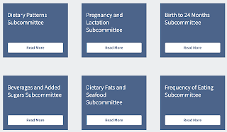
So let's keep clicking. If we click on the Dietary Fats and Seafood button, we see this promising menu.

You'd think that by clicking on one of the links, you'd be taken to a report on that subject. But you'd be wrong! Clicking the link merely scrolls the page to a bunch of buttons below, which gives you a chance to click some more.


The conclusion statement isn't that awful, but I'd kind of like to see some numbers! So let's keep clicking. If we click on Full Systematic Review, we might hope that we'd see a full systematic review. But instead we just get a link to the actual full systematic review, along with a helpful hint as to where the technical review is in the document (I mean, the technical review could be at the beginning of the technical review document, but we should know better by now).

After clicking Download Now, we finally get the report, and they get right to the point. The actual data starts already on page 73 of the document, the previous pages designed to alleviate any pesky insomnia the reader may be suffering from. What happens on page 73 is a paper-by-paper summary of all the results.

And this is actually one of the better ones. The Dietary Patterns subcommittee summary is filled with runic symbols that require a key to understand.

It doesn't have to be that hard. There's a very common technique of reporting a large number of conclusions in a relatively simple graph.

This chart shows the relative risk of developing Type-2 Diabetes based on consuming different foods. For instance, if you consumed the highest level of sugar sweetened beverages studied, you'd have a 131% change of Type-2 Diabetes compared to those that consumed the lowest amount studied. If you consumed the highest amount of yogurt studied, you'd have a 86% change of Type 2 Diabetes compared to those that consumed the lowest amount studied. Simple. Of course you have to read the report to find out what the highest and lowest reported amounts are, but this is an efficient and effective way of communicating a message. Why they didn't use it is beyond me.
I can't really complain that the scientific reviews are difficult to understand. I'm not a nutrition scientist, so if I don't understand what the summaries say, that's my fault, not the writers of this report. I complaints are mostly related to the obsession with process, the poor organization of the repot and abysmal user hostility of the site.
However, other people have complained about the guidelines. They are truly hated by broad swaths of the nutrition-expert classes. Many think they don't limit sugar enough. Some think the report isn't vegan enough, and possibly racist. The science is attacked from one side to another.
There's also a steady drumbeat in most of the criticism that the Dietary Guidelines are irredeemably compromised. The Guidelines are published by the US Department of Agriculture, after all, which can be expected to stand up for the interests of farmers and corporations associated with farming and dairy, as well as the food industry. What's usually termed "Big Ag" and "Big Food". So if the Dietary Guidelines don't go far enough to limit sugar, that's clearly due to the influence of sugar farmers and purveyors of sugary foods and drinks. And if they don't go far enough to limit alcohol, well have you seen how much grain Budweiser buys each year?
So the basic criticisms can be summarized as:
- The Guidelines are poorly written.
- As a result, they are incomprehensible to average people.
- They are based on flawed science.
- They clearly aren't working since so many Americans are fat
- The Guidelines are influenced by industry and lobbyists.
Other than that, they are fine.
So what of my original list of requirements for a successful public health campaign?
- It has to be easy to understand and remember. -- FAIL
- It has to be within the reach of most people. -- OK
- It has to be widely communicated. -- SUCCESS (through nutrition labels)
- It has to be be medically effective. -- FAIL (in practice, if not in theory)

Comments
Post a Comment